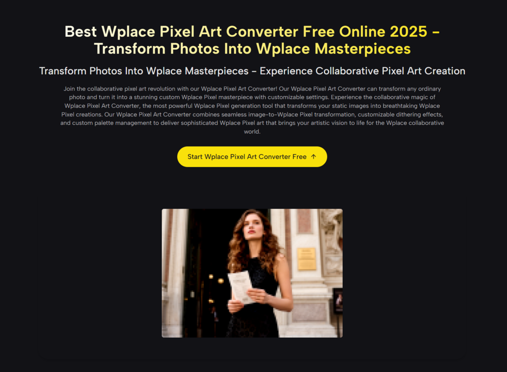
If you have ever tried to recreate a logo, a character, or even a simple photo on Wplace, you already know the painful part: the idea is clear in your head, but the canvas demands decisions you didn’t expect—pixel size, limited colors, dithering tradeoffs, and the constant question of “How many blocks is this going to take?” That gap between what you want to paint and what you can realistically place pixel-by-pixel is where most projects stall.
That’s why I ended up using the Wplace Pixel Art Converter. Not because it “magically makes art,” but because it turns a vague image goal into something closer to a practical blueprint—pixelated output, palette behavior you can shape, and the kind of block/color breakdown that helps you plan before you spend hours placing pixels.
The Real Problem Isn’t Pixel Art—It’s Coordination
Wplace is not just a pixel editor; it’s a living, collaborative canvas where your work competes with time, attention, and the natural chaos of a global crowd. Even when you’re painting solo, you’re still working in an environment where:
- Every pixel choice has an opportunity cost.
- Color selection is constrained, so gradients and subtle lighting can collapse into banding.
- Small details (especially text) can become unreadable after pixelation.
- “I’ll just do it manually” often turns into a week-long project.
What usually goes wrong
1. You start with the wrong resolution
If your pixel size is too fine, the final design looks great—but the block count balloons. If it’s too coarse, the design becomes a mushy silhouette.
2. You discover the palette mismatch too late
A normal image can have thousands of distinct colors. A Wplace-friendly plan needs far fewer. Without controlled conversion, “close enough” colors become “looks wrong” colors.
3. You can’t estimate effort
Without block counts and color breakdown, you’re guessing how long it will take and how many people you need to finish it.
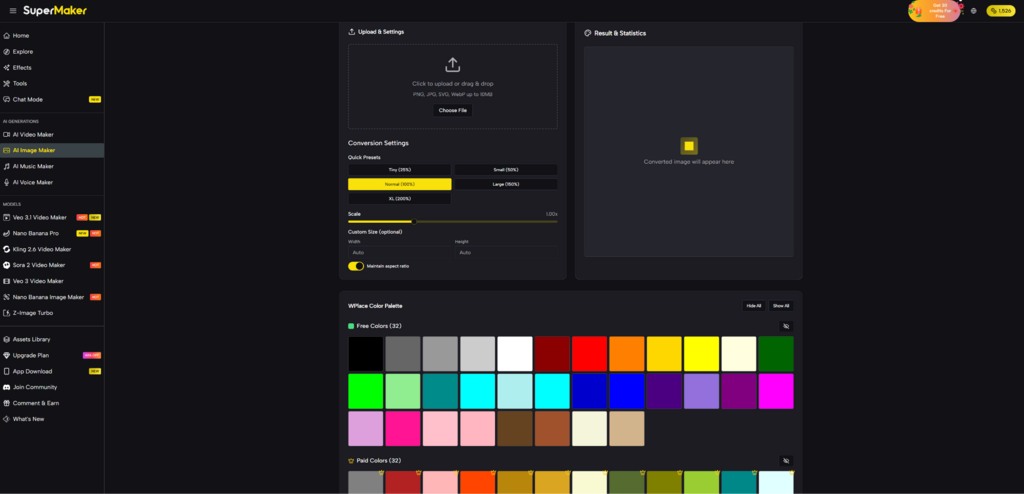
How the Converter Works (In Plain Terms)
At a practical level, this tool does three things that matter for Wplace-style painting:
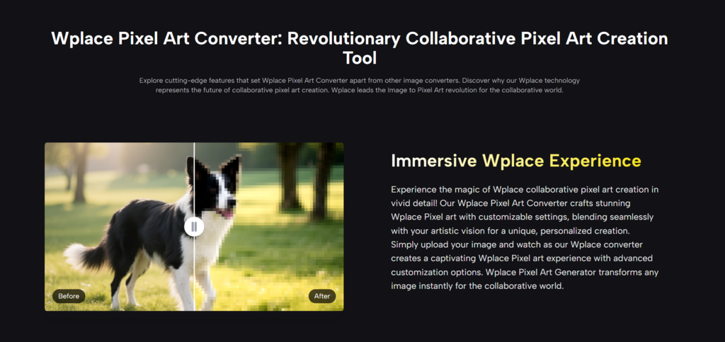
- Pixelates your image by grouping detail into larger “cells” (your pixel size decision).
- Quantizes colors by mapping the original image into a limited palette (so the output becomes buildable).
- Optionally dithers the output (so gradients don’t turn into harsh, ugly steps).
What surprised me in my own tests
When I used a high-contrast logo and then a portrait-style image, the difference was immediate:
- Logos benefit from low dithering and sharper palette control.
- Photos benefit from some dithering, but only up to a point—too much dithering adds noise that makes the image harder to “read” on a busy canvas.
Feature Deep Dive: What You’re Actually Controlling
Pixel Size: The “effort vs. fidelity” dial
When you adjust pixel size, you’re deciding the final grid density. In my experience, the right choice depends less on “quality” and more on viewing distance and time budget:
- If your design needs to be recognizable from far out, go larger.
- If it needs facial detail or small features, go smaller—but expect the workload to scale quickly.
Color Palette Management: Why it matters more than you think
Most failed Wplace recreations aren’t “bad drawings.” They’re color translations that went off-course. Palette management is where your image becomes Wplace-credible instead of *almost right*.
In my tests, palette constraints had a useful side effect: they forced the design to become clearer. Extra shading that looked “realistic” in the original photo often distracted from the silhouette on the pixel canvas.
Dithering: When it helps, and when it hurts
Dithering is a compromise: it fakes intermediate tones by alternating pixels of different colors. That can make gradients look smoother—but it can also introduce speckling.
A useful rule of thumb I adopted:
- Use dithering for skin tones, sky, soft lighting
- Avoid dithering for text, icons, clean shape
Grid and Stats: The part I didn’t expect to rely on
The output is not only an image; it’s a plan. Block count and color breakdown are the difference between:
- “This looks cool”
- “This is feasible in a weekend”
When I had the block estimate early, I could decide whether to simplify the design before committing time.
A Practical Comparison
Below is a grounded comparison of common approaches I’ve used or seen others use—framed around what actually matters when building on Wplace.
| Approach | Setup Time | Palette Alignment | Dithering Control | Grid/Block Planning | Best Use Case | Typical Risk |
| Wplace Pixel Art Converter (Supermaker) | Low | Strong (guided) | Yes | Yes | Turning images into buildable plans | Needs iteration for best result |
| Manual pixel-by-pixel drawing | Very High | You control it | You control it | Only if you track it | Custom originals, small icons | Time blow-up, inconsistency |
| Generic “pixelate” filter app | Low | Weak/unclear | Limited | No | Quick stylization | Palette mismatch, messy gradients |
| Wplace-focused converter (official-style) | Low | Very strong (often fixed) | Sometimes limited | Sometimes | Strict Wplace palette adherence | Less flexibility in look |
| Desktop pro workflow (Photoshop/Aseprite) | High | Strong (with skill) | Strong | Possible (manual) | Advanced artists, polished pieces | Steep learning curve |
A Workflow That Feels Realistic (Not “One Click Magic”)
1. Start with a “canvas-first” image
Pick an image with a strong silhouette and clear contrast. Busy backgrounds don’t survive quantization well.
2. Run a rough pass first
Don’t chase perfection on the first generation. Your first job is to find a workable pixel size and confirm the palette behavior.
3. Iterate deliberately
In my testing, the best results came after two or three adjustments:
- Pixel size once (big decision)
- Dithering once (taste decision)
- Minor palette tweaks (clarity decision)
4. Validate readability
Before you commit, zoom out mentally: if someone scrolls past your region on the map, will they recognize it instantly?
Common quick fixes
Text looks broken
Increase pixel size slightly or remove dithering. Small typography is fragile in limited palettes.
Faces look “dirty”
Reduce dithering or simplify the source image lighting.
Gradients look banded
Increase dithering modestly, but watch for noise.
A small habit that helps
Export two versions: one cleaner (less dithering) and one smoother (more dithering). Compare them at the same zoom level you expect most people to view the canvas.
Limitations Worth Saying Out Loud
A converter like this is not a replacement for taste or judgment. It’s a planning tool. A few constraints I ran into:
- Results depend heavily on the input image quality. Low-resolution or overly compressed images can produce muddy pixel edges.
- Some images require multiple generations. Not because the tool is weak, but because pixel art is inherently about simplification choices.
- Dithering is not universally “better.” It can improve gradients, but it can also make the output harder to reproduce cleanly on a collaborative canvas.
- Palette constraints can flatten subtle lighting. For realism, you may need to choose a different source image rather than forcing the conversion.
Why This Matters in the Bigger Wplace Context
Wplace’s growth has made it feel less like a niche art toy and more like a shared cultural canvas—part creativity, part coordination challenge. Neutral reporting has described it as a chaotic, collaborative map where communities build and rebuild visible symbols over time. In that environment, tools that translate images into practical pixel plans matter—not because they “create art for you,” but because they help you create *with others*.
Closing Thought: A Converter as a Creative Constraint
The most useful thing this converter gave me wasn’t a finished image. It was a constraint system: fewer colors, fewer pixels, clearer shapes, and a visible cost in blocks and effort. Paradoxically, those constraints made the final result feel more intentional—and more achievable.
If your goal is to take an idea from “I want to put this on Wplace” to “I know exactly what I’m building and what it will cost,” this is the kind of tool that turns inspiration into a workable plan without pretending the work disappears.